Wednesday, 9 March 2011
Product Research
A necklace would make a interesting way to display my typographic ideas, also tying in with the brief. Looking at contemporary necklace design for ideas for the market will build my knowledge of product aesthetics.
Artatheart a company use obscure objects to design
there necklaces. The colours and shapes catch the eye also doing a limited batch size adds to the desirability of the product. Using very up cycled methods is a way of creating an interesting idea at low cost.
This piece is simple yet effective in the fact it is a simple pen lid that has been chewed and sprayed and turned into a desirable object. The reflection of the piece and broken down areas play with the light added strange form to the product.
www.artatheart.co.uk
Tuesday, 8 March 2011
Using Type to Inform emotion
Using the darkness in literature I intend to inform the viewer emotion as this text will be added to my object. Creating the mood will mean the text will need to dark but instead of using lyrics or quotes I have decided to look into old literature because of the complex style of language 'H.G Wells' Time Machine has dark quotes relating to the 'Morlocks' although these are to character based and would maybe confuse the viewer to my intent.
Dante's 'The Divine Comedy', references 'the seven deadly' sins of Catholicism, although passages from this text can be very dark the use would be to literal and evil rather than uneasy and distressed.
Shakespeare's 'Othello' uses darkness but in the sense of envy in the creature called 'Iago' this creatures bitterness is displayed throughout the play in a distressed and uneasy manner.
"My cause is hearted: thine hath no reason./ Let us be conjunctive in our revenge against him./ If thou canst cuckold him, then dost thyself a pleasure, me a sport".
"Out of her own goodness make the net
That shall enmesh them all."
Application of the text will need thought as space is required for a quote of this size.
Does it need to be legible?
Material?
Durability
Dante's 'The Divine Comedy', references 'the seven deadly' sins of Catholicism, although passages from this text can be very dark the use would be to literal and evil rather than uneasy and distressed.
Shakespeare's 'Othello' uses darkness but in the sense of envy in the creature called 'Iago' this creatures bitterness is displayed throughout the play in a distressed and uneasy manner.
"My cause is hearted: thine hath no reason./ Let us be conjunctive in our revenge against him./ If thou canst cuckold him, then dost thyself a pleasure, me a sport".
"Out of her own goodness make the net
That shall enmesh them all."
Application of the text will need thought as space is required for a quote of this size.
Does it need to be legible?
Material?
Durability
Idea Generation
Continuing from the mind map into an visual idea generation phase using mood boards allowed me to structure Shape, Colour and texture. The main theme seemed to be an interest in uneasy typographic styles and images that didn't follow that rules of conventional style. Looking at the breaking down type face and shape of image is something that would give distressed emotion to the idea. Colour that gives uneasy emotion Browns, greys, and blues.
Moving forward with my idea of using a typographic style I created a mood board that tied in with brief. Needing to create artifact that could be used in the home, looking at imposing letter forms to imply the mood of distress and unease I was trying to create.
Using type effectively would require print processes like laser cutting, flock and foiling or screen printing. Using these processes the application of the material would have to be solid and also replicate the emotion using colour or use. Taking these factors into account The four main ideas for my product would be :
Moving forward with my idea of using a typographic style I created a mood board that tied in with brief. Needing to create artifact that could be used in the home, looking at imposing letter forms to imply the mood of distress and unease I was trying to create.
Using type effectively would require print processes like laser cutting, flock and foiling or screen printing. Using these processes the application of the material would have to be solid and also replicate the emotion using colour or use. Taking these factors into account The four main ideas for my product would be :
- An old school chair (Laser cut, screen printed)
- Necklace (Laser cut, foil)
- Lampshade (Laser cut, screen print)
- Knife block (Laser cut, foil)
Group Mind-Map
To start the the Idea development process we had a group mind map session over lunch this enabled us to have five different viewpoints on the idea of darkness and what it represented.
Having more input meant that we could easily start thinking about the darkness beyond horror, nasty and other simple thoughts and gain insight to more complex darkness themes.
Tuesday, 8 February 2011
Lino Print
Lino print is a similar process to dry point, by removing the negative space of the design you are left with the positive by applying ink to this enables you to create a print. The preparation of the lino is a time consuming process however the result are worth it.
After the cutting out the negative space the process is quick and easy the inks are water based so no binder is necessary and mixing colours is a simple process.
The press process is straight forward the lino is placed with a chosen medium on top the press is made of a simple rack and pinion assembly that presses the design onto the medium .
The outcome of my design was pleasing even though it happened by accident. The design had very strong lines and square type, the cutting process meant it was very difficult to get an exact replication so I decided to break the image down so the image had a distorted effect.
The feel of the first colour was to earthy although the image deserved an organic feel, as it would compliment the distressed style of the print. Changing to green gave it a more energetic feel as you can see.
After the cutting out the negative space the process is quick and easy the inks are water based so no binder is necessary and mixing colours is a simple process.
The press process is straight forward the lino is placed with a chosen medium on top the press is made of a simple rack and pinion assembly that presses the design onto the medium .
The outcome of my design was pleasing even though it happened by accident. The design had very strong lines and square type, the cutting process meant it was very difficult to get an exact replication so I decided to break the image down so the image had a distorted effect.
The feel of the first colour was to earthy although the image deserved an organic feel, as it would compliment the distressed style of the print. Changing to green gave it a more energetic feel as you can see.
Sunday, 6 February 2011
Laser Cutting

laser cutting is a technique, good for creating strong bold lines and is the closest representaion of a digital image. The preperation for the process is quite technical.
If taken forward more designs and lines stacked images could be achieved. There are many possible problems in the processes of this technique. Thinking about taking the process further 3D images and cut through ideas would be a way of moving design further.Using two different materials has created different results in the hard card the laser has burnt the lines slightly which has made the design bolder and has given it more impact however the wood has a cheap finish and reminds of MDF.
The plywood is a much cleaner material the lines haven't contrasted as well with the wood but the finish is a lot cleaner, maybe turning the laser up a bit would allow the material to get slightly burnt.
Friday, 4 February 2011
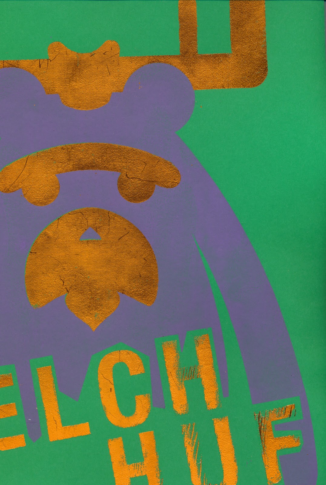
flock and foil
Flock and foil processes are very similar to the screen print process, except the application of glue is needed to be passed through the screen rather than ink.
After the glue has dried Heat needs to be applied to either the flock or the foil the heat makes the flock or foil stick to the image and when peeled reveals a foiled or flocked design.
Examples of the designs after heating, the process leaves a lot of excess waste, however the results are excellent.

The effects of this process really work well using a Ink for the first tone of my design meant that when flock and foil was added it complimented the Inks. The issues with this process are the colour choices, because of the expense of the material colours are limited. Moreover the material is delicate I had issues with parts of the material falling in the finishing stages, although it did create a nice finish it was not what I had intended.
It is obvious to see the registration is also an integral part of this process if not more so than screen printing, there is no bleed in flock and foil mistakes are evident.
After the glue has dried Heat needs to be applied to either the flock or the foil the heat makes the flock or foil stick to the image and when peeled reveals a foiled or flocked design.
Examples of the designs after heating, the process leaves a lot of excess waste, however the results are excellent.
The effects of this process really work well using a Ink for the first tone of my design meant that when flock and foil was added it complimented the Inks. The issues with this process are the colour choices, because of the expense of the material colours are limited. Moreover the material is delicate I had issues with parts of the material falling in the finishing stages, although it did create a nice finish it was not what I had intended.
It is obvious to see the registration is also an integral part of this process if not more so than screen printing, there is no bleed in flock and foil mistakes are evident.
Subscribe to:
Posts (Atom)