Saturday 12 March 2011

Evaluation

This project has been challenging and fast paced, although difficult at times refreshing and gaining knowledge in print processes has been invaluable. Learning new skills in the documentation of this project has been the one factor I will take away from this journey as I have had no prior interest in blogging. Trying to achieve the darkness in  The product itself was a challenge to develop as it was not a client/market I was familiar so research was an important factor also sticking concisely to the brief has meant I have ticked all the key areas to tie the product to the darkness. The product worked well in its environment when photographed and coincides with other products on the market although because of its nature and material stood out against its perspects counterparts. Moreover the poster design for ideas for branding and advertising using the product as a key element worked well to make the product eye catching using the golden section to do this.
If I did this project again I would spend more time in the experimental phase as this area of the project is where I gained most of my ideas and things really fell into place. Overall this project has help me to develop and use print ideas and has developed my confidence in these areas, my outcomes have been enjoyable and I have learned the auto graphic processes add character and feeling to outcomes .

Wednesday 9 March 2011

Display photography for consumer market

Product displayed in a shop for the consumer market allowing us to see how the product look with competitors.


The asthetics of the product work well I think its sits well with other products on the market. Using wood and flock has added extra desirability to the product compared to its perspects counterparts.


Choosing to photograph the image in a dark shop has worked well to further the mood of the piece. However I will like to photograph the piece on a model and create a WW2 feel to connect the bomb to the product in a darker way.

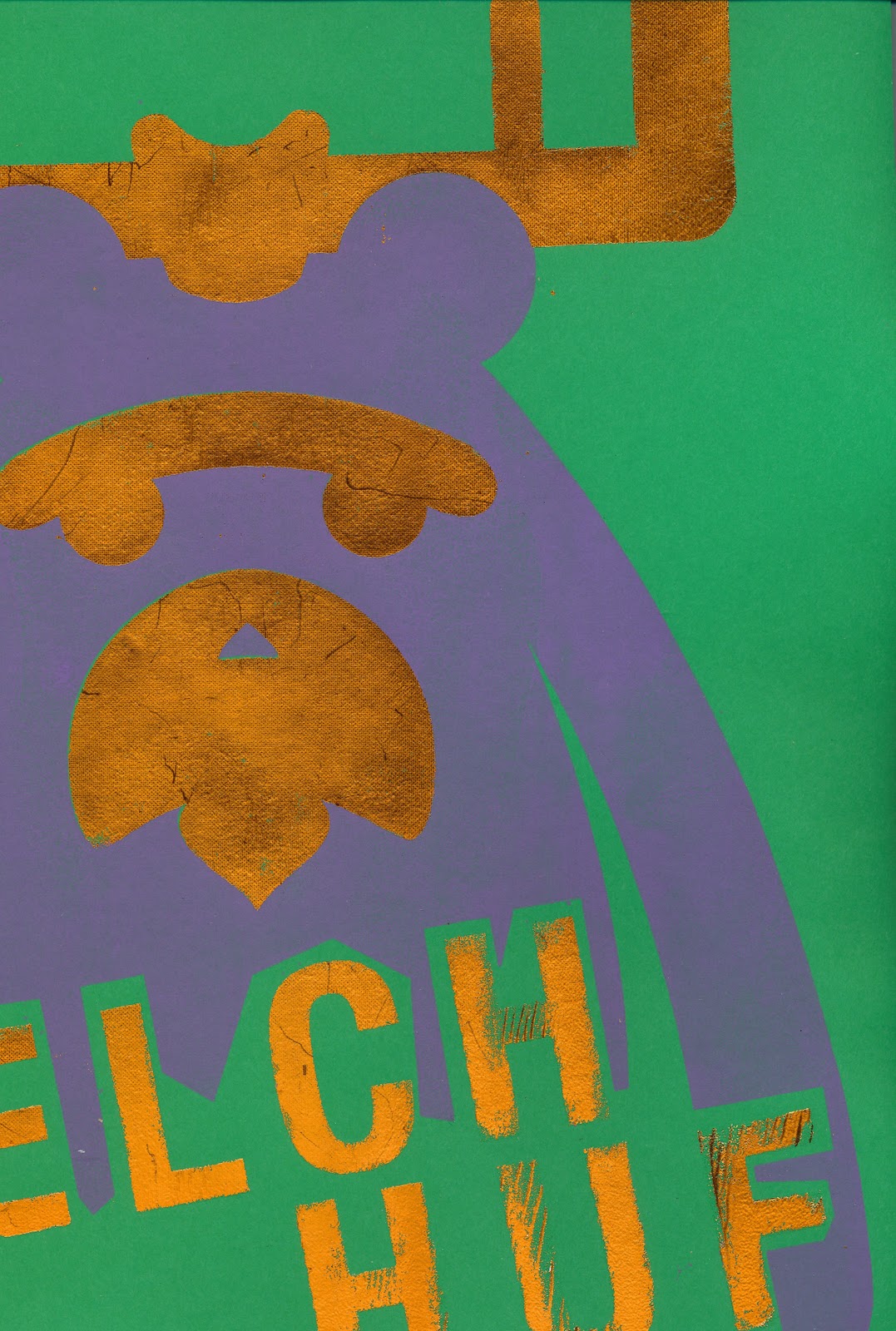
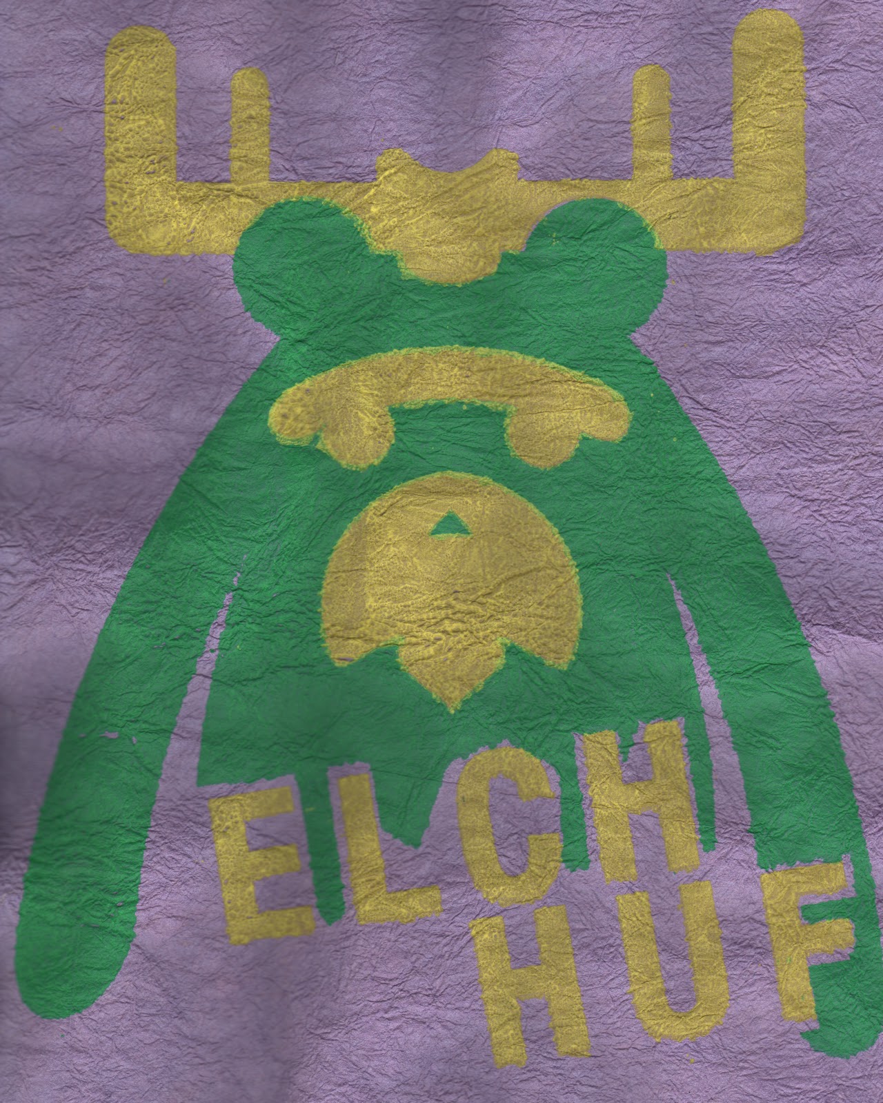
Poster design for branding

As this would be product on the consumer market creating an advertising poster to show the product  seemed the natural progression for me.
The image created using bitmap techniques shows the product falling as a representation of a bomb. I chose a pop art style as it adds a dark humour to the branding moreover the movement along with Swiss style was a product of modernism after the war. The colours compliment the browns of the wood as well as contrasting with them to make the product stand out.   


This is an idea of the prototype mount I have made for the product the flash is a cut out raised out of the image to create a depth style and a way to produce the product on a counter for the purposes of retail.

Laser cutting shape & type

Adding a simple shape to the outside of the type boarders and holds the type and also creates a way to mount the product to a chain. Choosing an F bomb shape makes the type fall in the right direction and also the bomb creates the idea of destruction which also adds to the darkness feel of the type.


laser cutting was the first process gaining the right burnt effect meant using extra lines to create a charred embossed type.


After varnishing the piece I moved in to a flocking process unfortunately this did not go well because of the varnish. Eventually after three attempts the process worked and the product had a flocked back to create a desirability.


To get over the problem of flocking I had to reduce the time of heating and repeat the process. The results made the piece interesting and texured to the touch.

Test cuts & Material experiments

Using different materials for testing the product will allow me to get the right feel for the piece. 5mm hardwood adds a strong grain to the cutting process also the laser burns the type slightly which creates unease to the effect. Although the hardwood is a material which will work well if i decide to cut a shape into the wood as well it will be very thick and may not hang as intended to combat this a thinner wood would work well.


Perspects is another material that I have experimented with however because of the nature of the type it has become illegible. Also the dot work I have added has embossed deeper holes into the type melting the perspects slightly although I want the viewer to work at reading the type, this is to distorted .


3mm ply was my final experiment which was a great material to work with, the type scored well into the wood coupled with the burnt effect created exactly the desired effect for the product.
Sanding the piece will create a cleaner look for the object, the foiling process may distort the type further so for my second process I may flock the back to make the product more aesthetically pleasing.

Distressing chosen typeface


 Code was the highest range of the survey so I decided to break the two different styles of layout to develop an idea of shape an placement. Using simple autographic techniques paper bending and screwing also adding ink.


Breaking down the type in this way added texture that was unachievable using hi fi techniques I was able to manipulate the type forms to my own specifications.
My idea is to use the texture in the trace process whaen vectorising this image so the paper will add extra depth and form.


After vectorising the image I was able to define the areas I needed for the laser cutting process. By tracing in gray scale an limiting the shades I could get a two tone image to create depth to the image although im not sure how this will affect the printing process.
I still think I will have to mount the type to allow for the delicate nature of the piece this in turn will allow me to add character and further the darkness theme. Getting over this problem? adding a simple outline shape or cutting the letters out singlely and applying them to the necklace individually 


The final product is now ready for cutting and has the obscure disgruntled look I am trying to achieve. The distressed look of the typeface gained by autographic techniques has created the the feeling of darkness alongside the nature of the text I have used. Adding the piece to dark wood will further the emotion also using a flock or foil process to add an extra layer of depth to the distress may help. 

Font & Shape

Deciding on the right on the right typeface was very important to get the right feeling for the piece. I found laying different typefaces on a contact sheet enabled me to to get an easy peer assessment by surveying.
The fuller fonts seemed to lose the meaning easily and as breaking down the font was the next phase they became to eligible and therefore became unusable. Another problem to consider was how to mount the thinner types as they would become very delicate in the cutting process. To get over this problem maybe a mounting is needed?.


Another way to arrange the type forms was to aline them with the neck allowing them to fall but complications arose as the letters would have to connect like a stencil to hold the product together. Design two contact sheets and surveying allow me to gain an idea of which people would perchase the product this process was invaluable.

Product Research


A necklace would make a interesting way to display my typographic ideas, also tying in with the brief. Looking at contemporary necklace design for ideas for the market will build my knowledge of product aesthetics.


Artatheart a company use obscure objects to design
there necklaces. The colours and shapes catch the eye also doing a limited batch size adds to the desirability of the product. Using very up cycled methods is a way of creating an interesting idea at low cost.


This piece is simple yet effective in the fact it is a simple pen lid that has been chewed and sprayed and turned into a desirable object. The reflection of the piece and broken down areas play with the light added strange form to the product.


www.artatheart.co.uk

Tuesday 8 March 2011

Using Type to Inform emotion

Using the darkness in literature I intend to inform the viewer emotion as this text will be added to my object. Creating the mood will mean the text will need to dark but instead of using lyrics or quotes I have decided to look into old literature because of the complex style of language 'H.G Wells' Time Machine has dark quotes relating to the 'Morlocks' although these are to character based and would maybe confuse the viewer to my intent.

Dante's 'The Divine Comedy', references 'the seven deadly' sins of Catholicism, although passages from this text can be very dark the use would be to literal and evil rather than uneasy and distressed.


Shakespeare's 'Othello' uses darkness but in the sense of envy in the creature called 'Iago' this creatures bitterness is displayed throughout the play in a distressed and uneasy manner.

"My cause is hearted: thine hath no reason./ Let us be conjunctive in our revenge against him./ If thou canst cuckold him, then dost thyself a pleasure, me a sport".

"Out of her own goodness make the net
That shall enmesh them all."

Application of the text will need thought as space is required for a quote of this size.

Does it need to be legible?

Material?

Durability


Idea Generation

Continuing from the mind map into an visual idea generation phase using mood boards allowed me to structure Shape, Colour and texture. The main theme seemed to be an interest in uneasy typographic styles and images that didn't follow that rules of conventional style. Looking at the breaking down type face and shape of image is something that would give distressed emotion to the idea. Colour that gives uneasy emotion Browns, greys, and blues.  


Moving forward with my idea of using a typographic style I created a mood board that tied in with brief. Needing to create artifact that could be used in the home, looking at imposing letter forms to imply the mood of distress and unease I was trying to create.
Using type effectively would require print processes like laser cutting, flock and foiling or screen printing. Using these processes the application of the material would have to be solid and also replicate the emotion using colour or use. Taking these factors into account The four main ideas for my product would be :

  • An old school chair (Laser cut, screen printed)
  • Necklace  (Laser cut, foil)
  • Lampshade (Laser cut, screen print)
  • Knife block (Laser cut, foil)

Group Mind-Map

To start the the Idea development process we had a group mind map session over lunch this enabled us to have five different viewpoints on the idea of darkness and what it represented.
Having more input meant that we could easily start thinking about the darkness beyond horror, nasty and other simple thoughts and gain insight to more complex darkness themes.

Tuesday 8 February 2011

Lino Print

Lino print is a similar process to dry point, by removing the negative space of the design you are left with the positive by applying ink to this enables you to create a print. The preparation of the lino is a time consuming process however the result are worth it.


After the cutting out the negative space the process is quick and easy the inks are water based so no binder is necessary and mixing colours is a simple process.


The press process is straight forward the lino is placed with a chosen medium on top the press is made of a simple rack and pinion assembly that presses the design onto the medium .


The outcome of my design was pleasing even though it happened by accident. The design had very strong lines and square type, the cutting process meant it was very difficult to get an exact replication so I decided to break the image down so the image had a distorted effect.
The feel of the first colour was to earthy although the image deserved an organic feel, as it would compliment the distressed style of the print. Changing to green gave it a more energetic feel as you can see.

Sunday 6 February 2011

Laser Cutting


laser cutting is a technique, good for creating strong bold lines and is the closest representaion of a digital image. The preperation for the process is quite technical.

 If taken forward more designs and lines stacked images could be achieved. There are many possible problems in the processes of this technique. Thinking about taking the process further 3D images and cut through ideas would be a way of moving design further.
Using two different materials has created different results in the hard card the laser has burnt the lines slightly which has made the design bolder and has given it more impact however the wood has a cheap finish and reminds of MDF.


The plywood is a much cleaner material the lines haven't contrasted as well with the wood but the finish is a lot cleaner, maybe turning the laser up a bit would allow the material to get slightly burnt.

Friday 4 February 2011

flock and foil

 Flock and foil processes are very similar to the screen print process, except the application of glue is needed to be passed through the screen rather than ink.
 After the glue has dried Heat needs to be applied to either the flock or the foil the heat makes the flock or foil stick to the image and when peeled reveals a foiled or flocked design.


 Examples of the designs after heating, the process leaves a lot of excess waste, however the results are excellent.


The effects of this process really work well using a Ink for the first tone of my design meant that when flock and foil was added it complimented the Inks. The issues with this process are the colour choices, because of the expense of the material colours are limited. Moreover the material is delicate I had issues with parts of the material falling in the finishing stages, although it did create a nice finish it was not what I had intended. 

It is obvious to see the registration is also an integral part of this process if not more so than screen printing, there is no bleed in flock and foil mistakes are evident.

Screen Print

Screen printing is a process similar to stenciling, the idea is that ink is passed through a fine mesh some of the holes are blocked and the image printed is exposed to the ink. A clean and organised workspace is integral to a decent print print run.

 After placing a design onto acetate the screen(coated in emulsion) must be exposed to UV light. The black areas of the design will not be exposed allowing them to be washed away at a later stage.
 Washing the screen is important to get right as if done wrong the the image will not come through properly meaning the print will not be successful. As a rule washing the screen the for thirty seconds on the back will loosen the emulsion you want to expose, after which washing the front will allow your design to be exposed ready for printing. 
Pulling the image through onto a test sheet will ensure the image is clean. It is important to remember to register your image to the screen or your run will look all over the place.
 Colour choice is also an integral part of the process as this will completely change the feeling of your image, depending on the purpose of your image.


 The image looks clean and crisp and the colour I have chosen contrast with each other to create impact. Texture really helped me to create different feels to the image, I have created different textures by using different paper from 80g to handmade.
Lines and creases in the paper has created some interesting effects within the design. This paper was slightly damp allowing the image to bend out of shape while it dried. If done again I would like to screw up some paper to increase the effect.
Finally using handmade paper created the best results the purple colour complements the image and give it a warm organic feel. The ink did not sink into the paper as well as I wanted, but the accident really turned out well.

Dry point

 Dry point is basic print process that belongs to the Intaglio family of printmaking. By creating a burr in different materials we can achieve the most basic of print forms. The beauty of this print process is it accessibility, being cheap and relatively easy to do.
The Idea of Dry point is to etch into the surface, in this case using a thick acetate, depending on the depth, direction or shape of the cut enables different affects.


After adding a simple mix of ink and binder to the etched side of acetate we need to remove all the ink, accept the ink in the burrs of the design.
(For best results in the process use newsprint or blue roll.)


This press is ideal for the transfer of pressure onto the design but wet paper helps the transfer become more effective.(however the use of a boss clamp would gain the same result). Adding the acetate to the press face up and applying the wet paper, roll the design through the press. (twice for best results). Remove the paper and quickly go through the process again, as the line more defined after the second print. 


This image outlines the different techniques the are possible using, stroke, depth of cut direction, and angle.
At first the Ideas do not come easily but by referencing other artists and looking at how they use the line helped a lot.Toppi, Garth Ennis and Jeff Lemire, comic artists use intricate lines using direction to imply tone and shape.
 As my design has bold lines and simple shape, considering how to create an interesting Drypoint process was an enjoyable experience for me. I used a multitude of different lines to create different simple effects to bring my idea to life.

Using deeper lines on the outside of the design gave contrast between the shape and texture. The most difficult aspect of the image during this process was the type. If doing this process again using a strong san serif type like 'Helvetica' is not a good idea, as the nature of the process means defined straight lines are very difficult.  Also remembering that tranfering type means it needs to be mirrored. Although I have used Photoshop to flip my image my original prints are backwards.


Using a different product like 90g card produced completely different effects all together. The ink did not tranfer aswell but the texture of the card broke done the card in a really interesting way by disecting lines.