Tuesday 8 February 2011

Lino Print

Lino print is a similar process to dry point, by removing the negative space of the design you are left with the positive by applying ink to this enables you to create a print. The preparation of the lino is a time consuming process however the result are worth it.


After the cutting out the negative space the process is quick and easy the inks are water based so no binder is necessary and mixing colours is a simple process.


The press process is straight forward the lino is placed with a chosen medium on top the press is made of a simple rack and pinion assembly that presses the design onto the medium .


The outcome of my design was pleasing even though it happened by accident. The design had very strong lines and square type, the cutting process meant it was very difficult to get an exact replication so I decided to break the image down so the image had a distorted effect.
The feel of the first colour was to earthy although the image deserved an organic feel, as it would compliment the distressed style of the print. Changing to green gave it a more energetic feel as you can see.

Sunday 6 February 2011

Laser Cutting


laser cutting is a technique, good for creating strong bold lines and is the closest representaion of a digital image. The preperation for the process is quite technical.

 If taken forward more designs and lines stacked images could be achieved. There are many possible problems in the processes of this technique. Thinking about taking the process further 3D images and cut through ideas would be a way of moving design further.
Using two different materials has created different results in the hard card the laser has burnt the lines slightly which has made the design bolder and has given it more impact however the wood has a cheap finish and reminds of MDF.


The plywood is a much cleaner material the lines haven't contrasted as well with the wood but the finish is a lot cleaner, maybe turning the laser up a bit would allow the material to get slightly burnt.

Friday 4 February 2011

flock and foil

 Flock and foil processes are very similar to the screen print process, except the application of glue is needed to be passed through the screen rather than ink.
 After the glue has dried Heat needs to be applied to either the flock or the foil the heat makes the flock or foil stick to the image and when peeled reveals a foiled or flocked design.


 Examples of the designs after heating, the process leaves a lot of excess waste, however the results are excellent.


The effects of this process really work well using a Ink for the first tone of my design meant that when flock and foil was added it complimented the Inks. The issues with this process are the colour choices, because of the expense of the material colours are limited. Moreover the material is delicate I had issues with parts of the material falling in the finishing stages, although it did create a nice finish it was not what I had intended. 

It is obvious to see the registration is also an integral part of this process if not more so than screen printing, there is no bleed in flock and foil mistakes are evident.

Screen Print

Screen printing is a process similar to stenciling, the idea is that ink is passed through a fine mesh some of the holes are blocked and the image printed is exposed to the ink. A clean and organised workspace is integral to a decent print print run.

 After placing a design onto acetate the screen(coated in emulsion) must be exposed to UV light. The black areas of the design will not be exposed allowing them to be washed away at a later stage.
 Washing the screen is important to get right as if done wrong the the image will not come through properly meaning the print will not be successful. As a rule washing the screen the for thirty seconds on the back will loosen the emulsion you want to expose, after which washing the front will allow your design to be exposed ready for printing. 
Pulling the image through onto a test sheet will ensure the image is clean. It is important to remember to register your image to the screen or your run will look all over the place.
 Colour choice is also an integral part of the process as this will completely change the feeling of your image, depending on the purpose of your image.


 The image looks clean and crisp and the colour I have chosen contrast with each other to create impact. Texture really helped me to create different feels to the image, I have created different textures by using different paper from 80g to handmade.
Lines and creases in the paper has created some interesting effects within the design. This paper was slightly damp allowing the image to bend out of shape while it dried. If done again I would like to screw up some paper to increase the effect.
Finally using handmade paper created the best results the purple colour complements the image and give it a warm organic feel. The ink did not sink into the paper as well as I wanted, but the accident really turned out well.

Dry point

 Dry point is basic print process that belongs to the Intaglio family of printmaking. By creating a burr in different materials we can achieve the most basic of print forms. The beauty of this print process is it accessibility, being cheap and relatively easy to do.
The Idea of Dry point is to etch into the surface, in this case using a thick acetate, depending on the depth, direction or shape of the cut enables different affects.


After adding a simple mix of ink and binder to the etched side of acetate we need to remove all the ink, accept the ink in the burrs of the design.
(For best results in the process use newsprint or blue roll.)


This press is ideal for the transfer of pressure onto the design but wet paper helps the transfer become more effective.(however the use of a boss clamp would gain the same result). Adding the acetate to the press face up and applying the wet paper, roll the design through the press. (twice for best results). Remove the paper and quickly go through the process again, as the line more defined after the second print. 


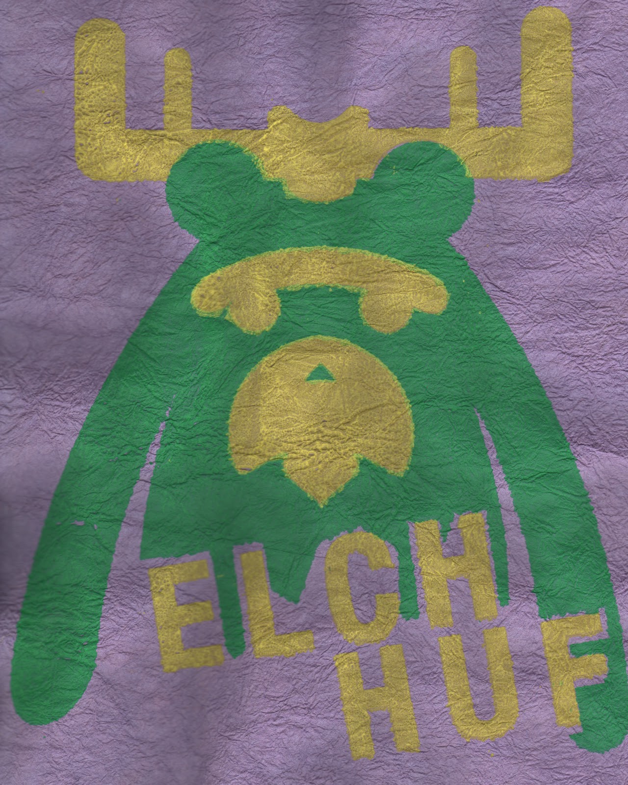
This image outlines the different techniques the are possible using, stroke, depth of cut direction, and angle.
At first the Ideas do not come easily but by referencing other artists and looking at how they use the line helped a lot.Toppi, Garth Ennis and Jeff Lemire, comic artists use intricate lines using direction to imply tone and shape.
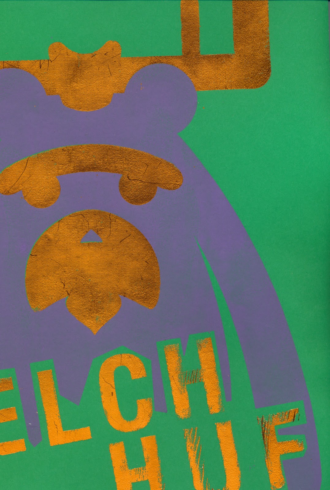
 As my design has bold lines and simple shape, considering how to create an interesting Drypoint process was an enjoyable experience for me. I used a multitude of different lines to create different simple effects to bring my idea to life.

Using deeper lines on the outside of the design gave contrast between the shape and texture. The most difficult aspect of the image during this process was the type. If doing this process again using a strong san serif type like 'Helvetica' is not a good idea, as the nature of the process means defined straight lines are very difficult.  Also remembering that tranfering type means it needs to be mirrored. Although I have used Photoshop to flip my image my original prints are backwards.


Using a different product like 90g card produced completely different effects all together. The ink did not tranfer aswell but the texture of the card broke done the card in a really interesting way by disecting lines.